Probability Graph
The probability graph displays a sample as a cumulative distribution, as different from the probability density graph or the histogram. The horizontal axis is the variable x, and usually linear or logarithmic. The vertical axis is a special probability scale derived from the inverse normal distribution function. The advantage of the probability scale is that samples that are approximately normally distributed fall on a straight line on such a graph. Also if the X-scale is logarithmic, a lognormal distribution would be a straight line, as in the example. At half the height of the graph the 0.5 probability is placed. From there up and down the positions of other probabilities are measured in standard deviation units. For instance: the mean (at 50%) plus two standard deviations correspond roughly with 95% and the mirror image is the 5% line two standard deviations below the 50%. As the normal distribution is running from minus infinite to plus infinite, the probability scale is doing the same in terms of standard deviations.
This may all be simple, but to plot all points of a sample of size n, we have to assign a cumulative probability to each of the n values. So value i is at i/n and value n is at n/n = 1 The problem is that 1, or 100% does not figure on our graph paper as it lies out there in outer space or even beyond. Solution: we plot point i=1 at 1/(n+1) and so on. Slight distortion, but this is what most people do. However the distortion can be limited by using a slightly different formula for the point position as suggested by Benard et al.(1953):
This puts the points in a "median" position and therefore the least biased manner of plotting the data and reportedly it is valid for a wide range of distribution types.
It should be noted that the heavy black line representing the distribution, as given by the sample data, is not the result of a regression analysis but a line forced through the 50% cumulative probability and the mean and a slope determined by the standard deviation. *
Goodness of fit
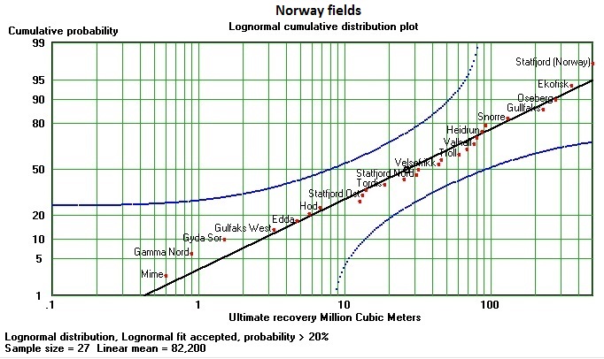
A look at the graph may convince us that the data follow the chosen distribution type. However, there are various methods to test the null-hypothesis that the data do follow the theoretical distribution. A widely used one is the Chi-square test. Here we use the Kolomogorov-Smirnoff one-sample test, a non-parametric test of goodness of fit, as it can easily be shown on the probability plot. For each sample size and a significance level there is a maximum deviation for a point up or down from the straight line. The blue curves are a fixed percentage away from the straight line. Because of the vertical probability scale the blue lines are curves. Now, for the test, it is sufficient to reject the null-hypothesis, if a single point falls outside these Kolmogorov-Smirnoff limits. In the above example the 5%-95% range would be much wider than the 20% limits shown. Therefore our graphical test is a severe one. There is no point even near the limits. Conclusion: a good fit.
However, there is a caveat. Statistically speaking our straight line should be based on a theoretical mean and standard deviation which we do not know. We draw the straight line on the basis of the sample mean and standard deviation. We err on the conservative (severe) side.